Zatient®
AI-based patient decision assistant
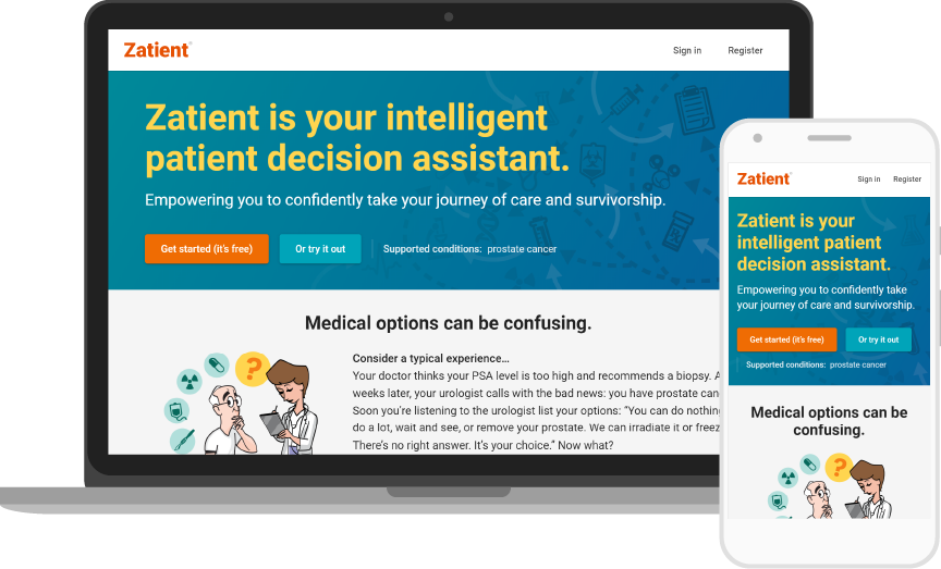
Zatient is an AI-based decision assistant for patients with complex health conditions that provides personalized guidance throughout their treatment journey. The web application, made by XFI Corporation, helps users make informed decisions based on individualized information and state-of-the-art medicine.
Problem and solution
Patients are often presented with treatment choices by their doctors. For example, a choice between surgery or radiation may provide similar statistical outcomes, but the impact on the patient differs greatly. Zatient guides patients through the available options that are tailored to their unique circumstances. It helps patients make critical choices more confidently and in accordance with their values and preferences. As a result, patients are empowered to engage with their doctors and actively participate in their treatment.
Audience
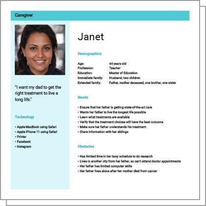
Zatient caregiver persona.
The initial users were prostate cancer patients and their caregivers, but the user experience was abstracted to accommodate a variety of health conditions, including breast cancer, heart disease, and Alzheimer’s disease.
Three primary personas informed the user experience: a patient who was newly diagnosed and is seeking treatment, a patient who was screened and is concerned, and a caregiver who is helping a loved one with treatment.
Responsibilities
As the sole UX/UI designer and front-end developer, I created the user experience and user interface for Zatient. I collaborated with a team of product managers, software engineers, and data specialists to refine the design solution. I conducted user research and produced detailed user experience artifacts, including personas, user flows, wireframes, mockups, and high-fidelity prototypes.
I created the visual design, developed a responsive interface, produced a design system, and generated the interface assets. I defined content templates and workflows. I wrote all the HTML, CSS, and JavaScript code for the browser as templates and component libraries for the software engineers to integrate with our back-end Java systems. I conducted usability testing. I art directed an illustrator to provide icons and spot illustrations, and I also designed marketing collateral for the product.
User experience
When users begin with Zatient, the primary challenge is how to collect information without overwhelming them with a long, upfront interview. We leverage several techniques to accomplish this.
Zatient first asks key questions to determine where users are in the treatment process. For example, have they just received a diagnosis, or are they considering treatment options? The application uses this input to position users in a specific region of their treatment journey, which is shown in the context of a map.
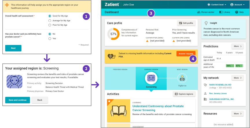
- Registration process collects information.
- Region of care is assigned.
- Zatient dashboard with region map and activities.
- Zatient prompts for missing information.
Once placed in a region, Zatient presents users with a dashboard of information and activities, such as assessments, decisions, and education. These activities are personalized to the user and region, so the system shows only information that is relevant and useful at that moment. To help guide the user, the application highlights the suggested next actions in orange.
To refine the suggestions and personalization, Zatient asks follow-up questions through assessment activities and direct prompts. Progress is indicated by a prominent gauge that shows whether there is sufficient patient data to make accurate suggestions for the region. This feedback loop sets up the conversational cadence of the application.
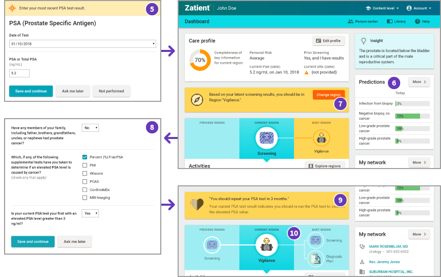
- Zatient collects missing information.
- Predictions are updated using new information.
- User is prompted to change to new care region.
- Zatient requests clarifying information when switching between regions.
- New personalized guidance based on patient health information and medical best practices.
- The journey map now shows the past region, current region, and potential next regions.
When the system calculates that the user should advance to the next region, the application prompts the user to move when ready. To avoid unexpected changes to the dashboard and available activities, the transition does not happen automatically. The user always remains in control of the navigation and can explore other regions at any time.
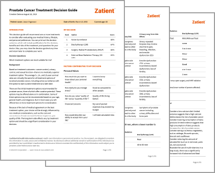
Zatient document from a decision activity.
The results of the activities can be output in dynamically generated documents that can be shared with the user’s healthcare team. The documents serve as talking points to help users actively participate in their treatment.
User interface
This project gave me the opportunity to create a new design system without legacy constraints. I instituted modern best practices throughout the system, including mobile-first responsive design, touch-friendly components, a comfortable density, and a clear typography system.
On a technical level, the project also allowed me to institute CSS flexbox for layout, SVG graphics for crisp display at any screen resolution, image source sets for download performance, and Block Element Modifier (BEM) naming conventions for developer clarity.
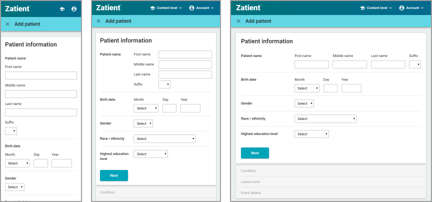
Responsive form layout at various sizes.
I designed the user interface with a responsive layout to accommodate mobile, tablet, and desktop devices in a single web app. The software engineers originally wanted to develop a separate interface for mobile web users, but my early responsive design prototypes convinced them otherwise. Native mobile apps were still planned for the future, so I adopted some Google Material Design guidelines to enable smoother implementation as a native Android app. A native iOS app would be built after Android.
The primary building blocks of the framework are panels and cards. Within those are lists, data grids, and forms. This core set of components proved versatile enough to handle almost all user experiences in the application. Prototyping could then be done rapidly in HTML to test user experience concepts.
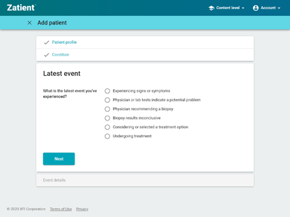
Stepwise task sequence with accordion-style navigation.
Stepwise task sequences are presented as an accordion group of panels. Previous steps in the sequence stack at the top to allow for easy return navigation. Accordion stacking allows consistent navigation for both desktop and mobile users. An alternative approach would be to place the previous steps in a side navigation bar, but this sidebar would then be hidden on mobile.
Forms are the bread and butter of user interactions, and Zatient relies heavily on them. I designed components for several complex input patterns. I implemented inline expansion for follow-up questions and additional input. For example, checking an item reveals form inputs that are visually linked to the checked item. I also built an inline form addition component for multiple data entries, a list builder that moved items to a rejection list with progressive disclosure, and reordering within a list. I developed each of these examples to be fully interactive on the client side without server communication.
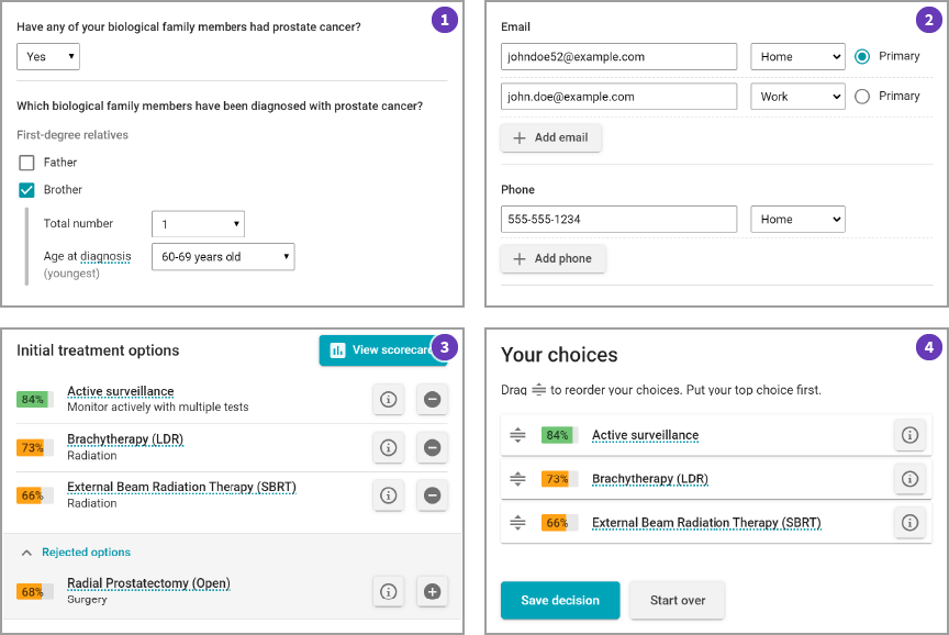
- Form with inline expansion.
- Form with inline add.
- List builder.
- List reordering.
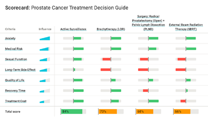
Zatient decision scorecard.
Data visualization in the interface is handled primarily with linear or radial bar gauges. The bar gauges can appear inline wherever data is displayed for easier visual comparison. They also are fully responsive to screen size changes. A more complex example can be seen in the decision scorecard, which shows how well a user’s preference matches a given decision option. The value of the match is shown with a dipole gauge that can be positive or negative. The overall weight or influence of each preference is shown with a volume-style gauge. This rich data display helps the user see why a particular option scores well or poorly.
Outcome
Zatient was featured at the Health 2.0 Conference after a competitive application process. With accolades and interest from healthcare organizations and patient advocacy groups, XFI continues to seek funding to support and grow the product.